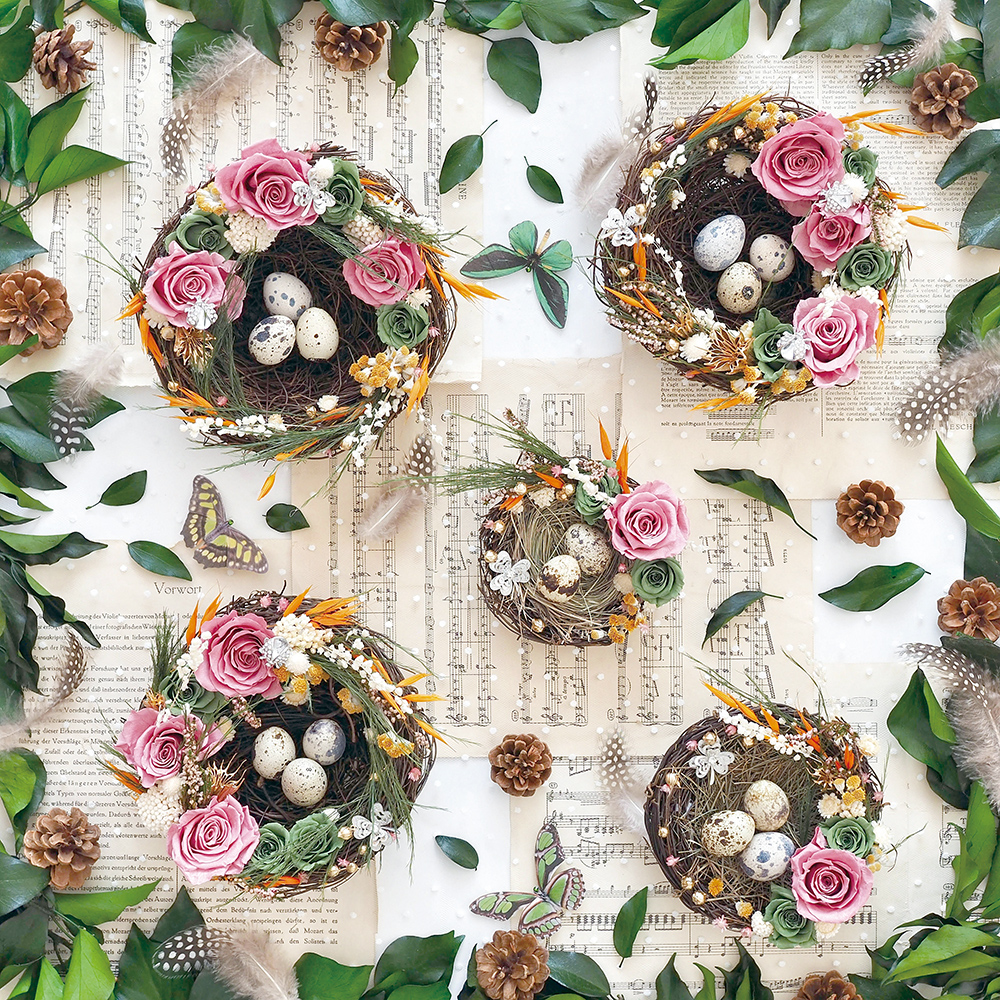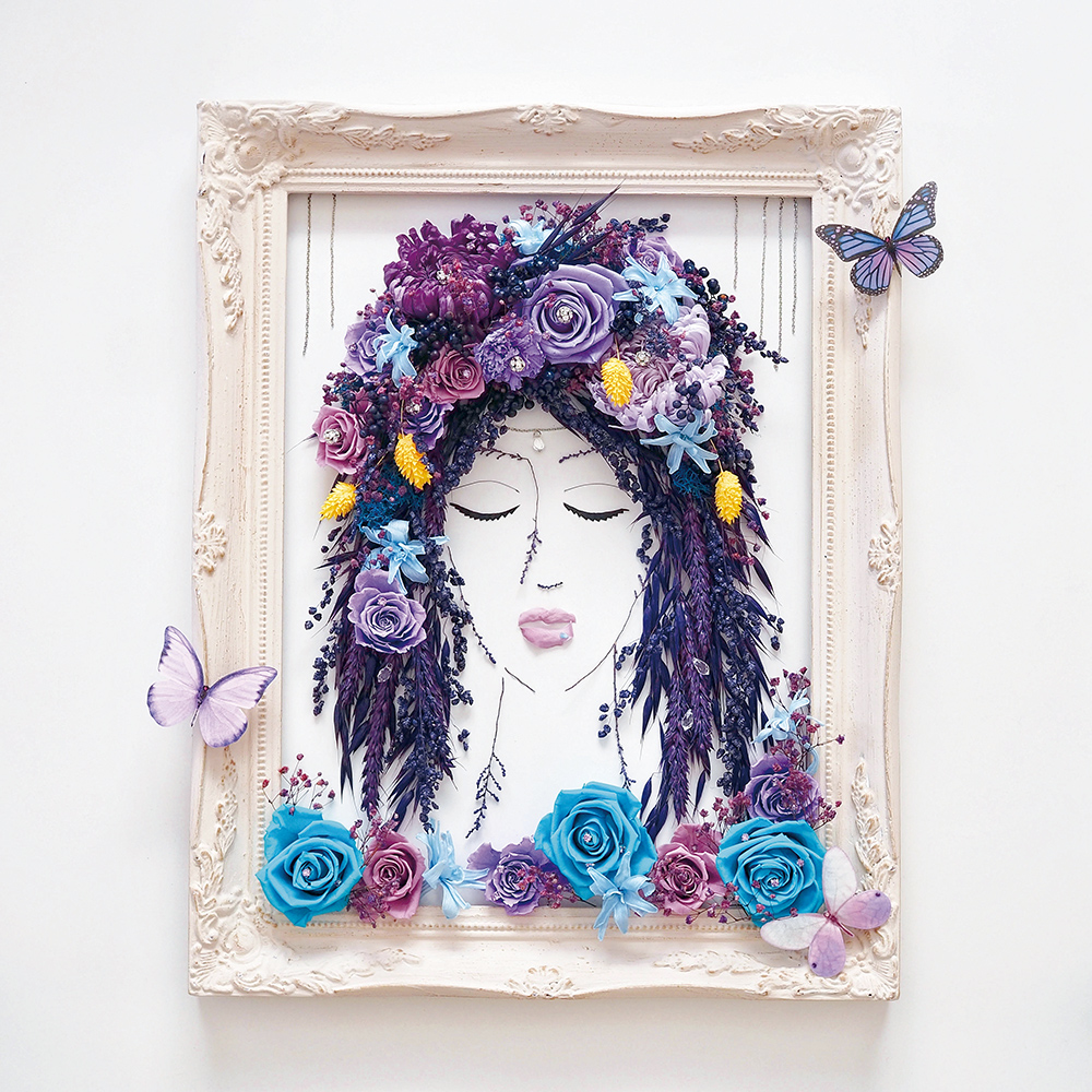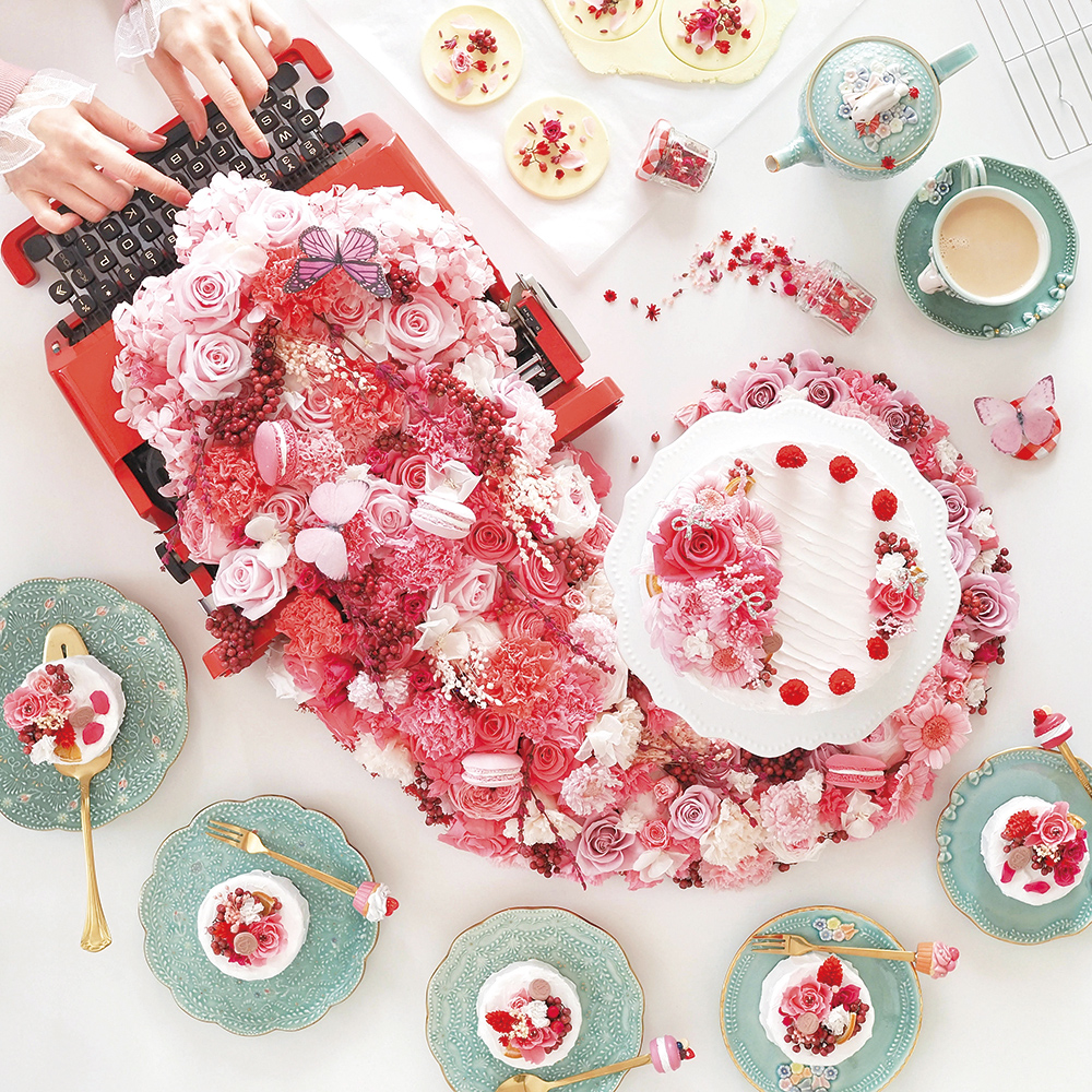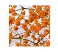
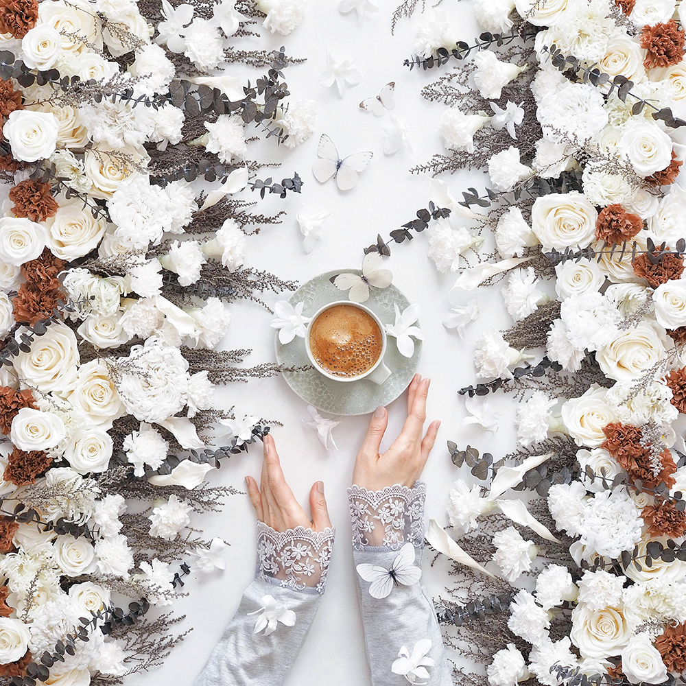
A butterfly flew in from somewhere
nviting us to go into the woods.
A butterfly flew in from somewhere
nviting us to go into the woods.
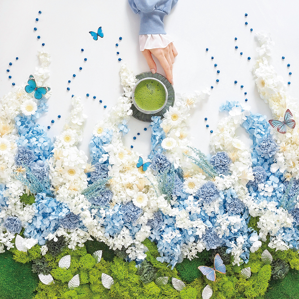
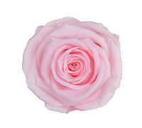
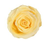
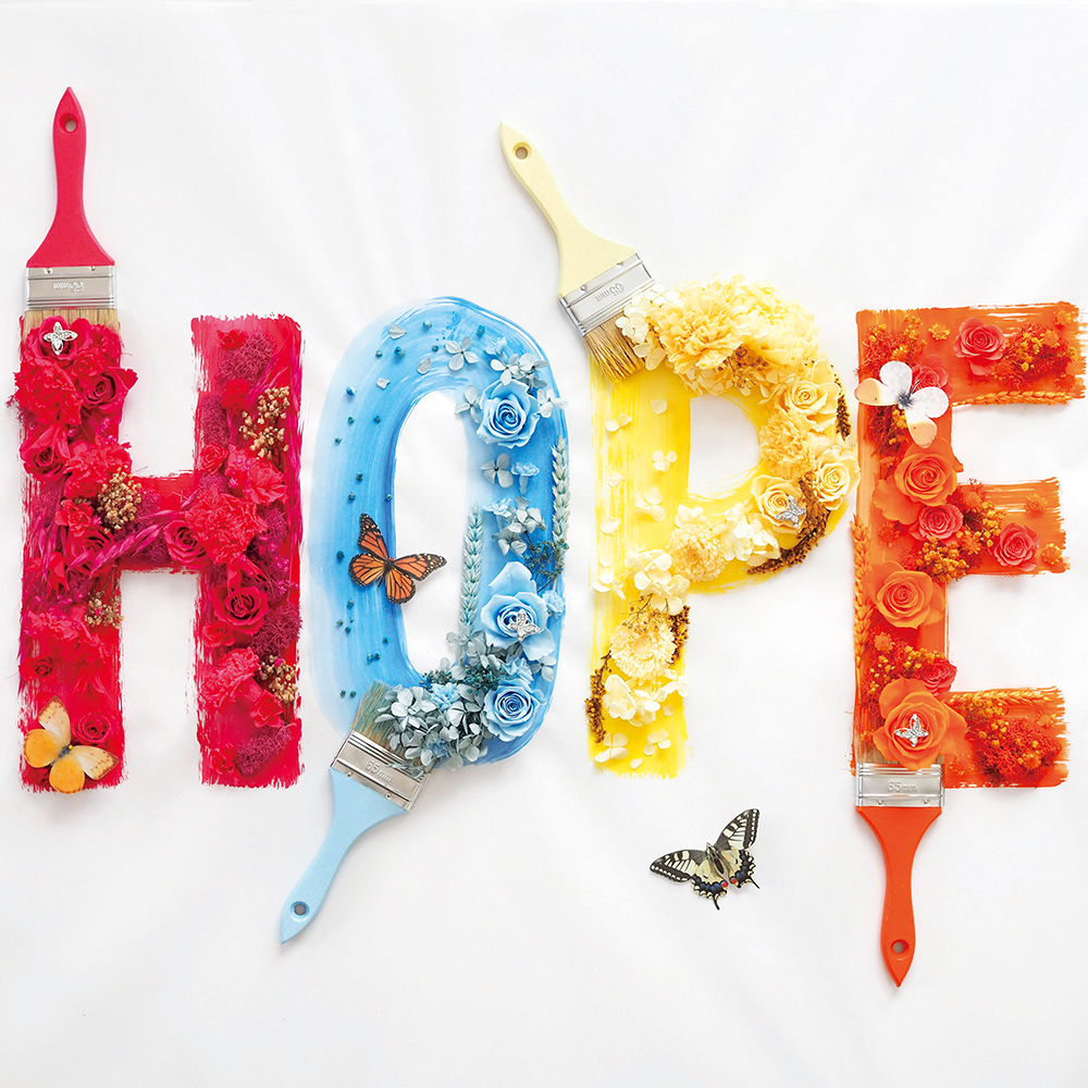
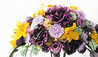
Wrapped in a Sense of Security - Soft and Basic Colors
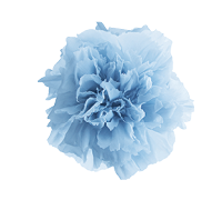
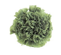
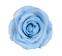
Keyword / Sense of Security / Stability / Blending in / Blurring / Neutral / Warmth
An era of the unseen pandemic. It has greatly changed the way of life, and the adjusting process has caused everyone stress which has accumulated without you realizing.
With anxious feelings of not knowing what will happen in the future, gentle and calm colors are necessary more than ever. The color scheme has softness, that relieves tension and provide you with calmness when you spend time reflecting on yourself.

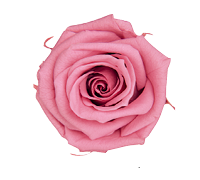
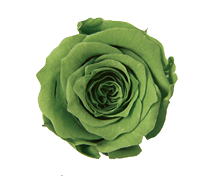
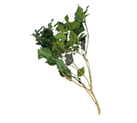
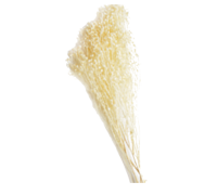
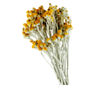
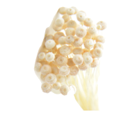
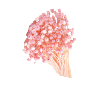
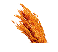
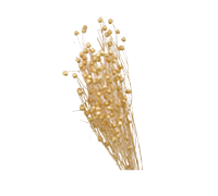
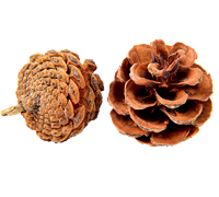
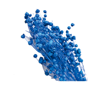
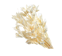
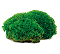
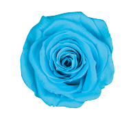
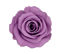
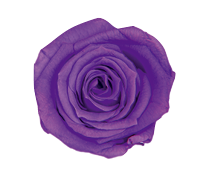
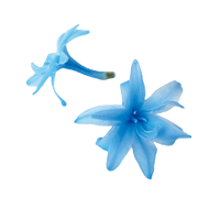
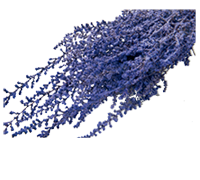
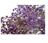
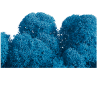
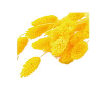
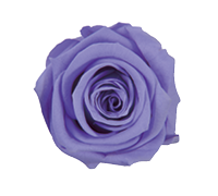
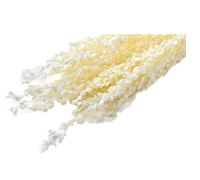
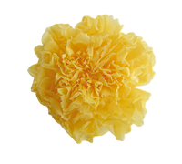
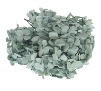
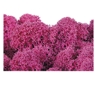
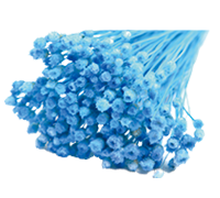
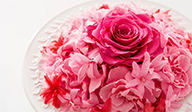
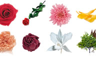
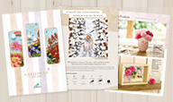
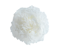
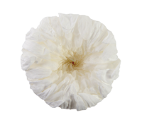
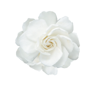
Products used in this arrangement
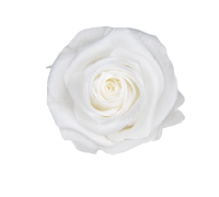
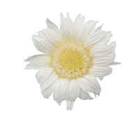
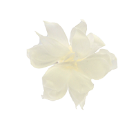
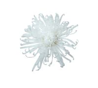
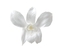
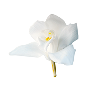
1-Pearl White
1-Pearl White
1-Pearl White
1-Pearl White
1-Pearl White
1-Pearl White
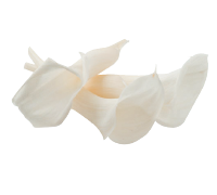
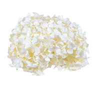
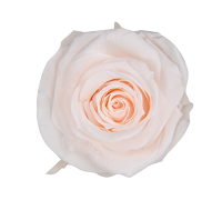
3-Ivory
1-Pearl White
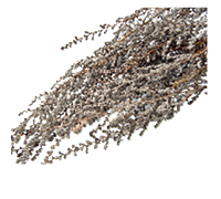
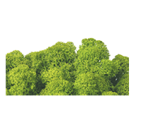
910-Natural
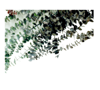
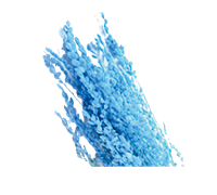
840-Gray
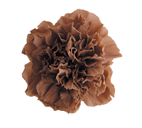
21-Light Cafe