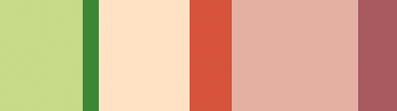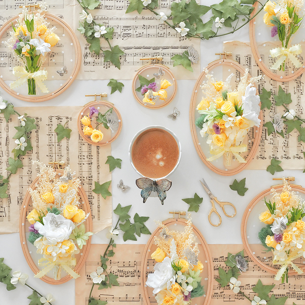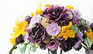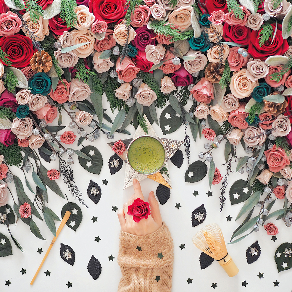
Brown: Color of the soil that gives life
Keyword / Dirt / Nature / Organic / Blends into the environment / Healing / Forest
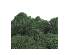
As people are focusing more and more on the environmental issues, the color brown is attracting the attention in many different fields.
Brown is the color of the earth, of dirt, and of skin, and it calms people down and gives them the peace of mind.
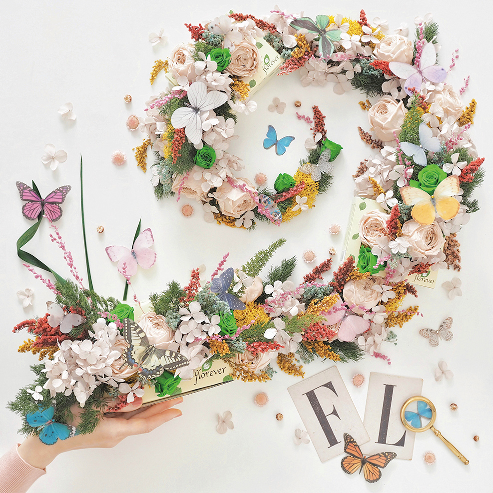
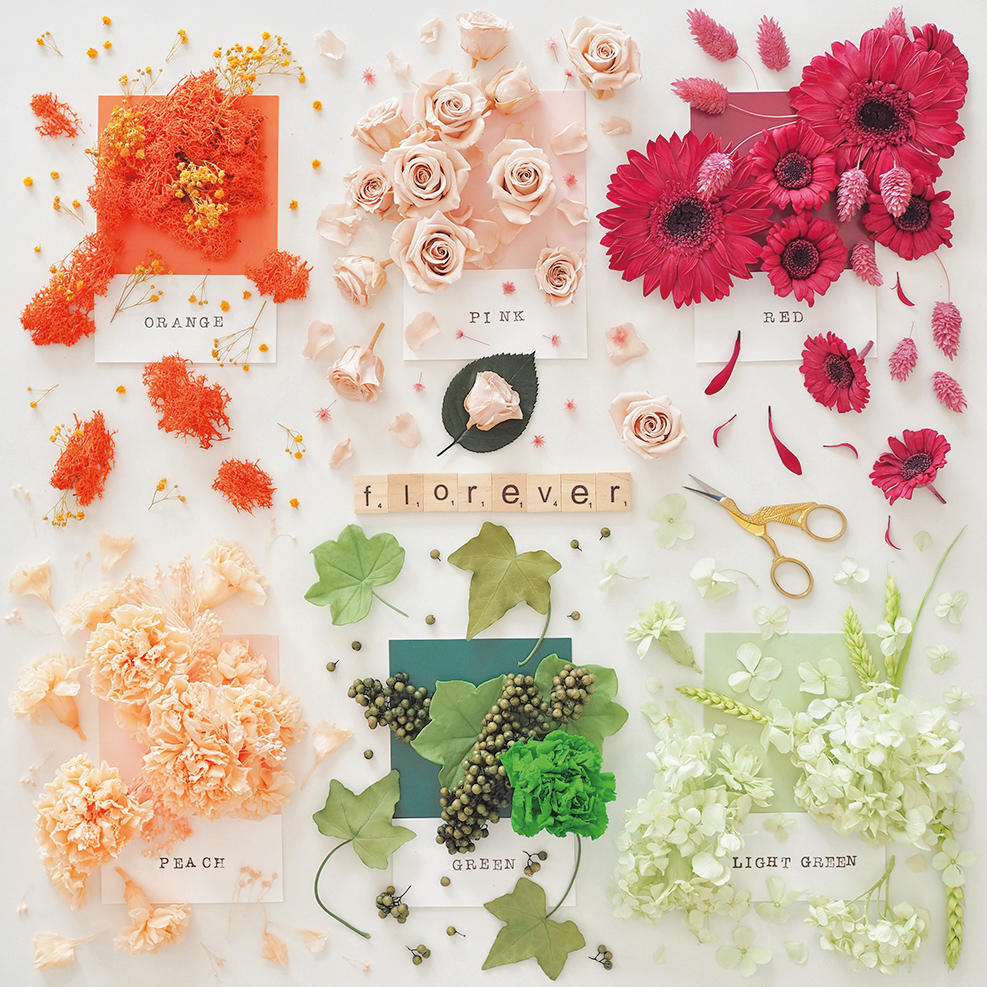
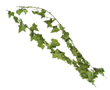
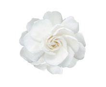
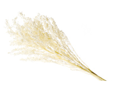
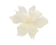
This group uses the brown colors as a base, accented with deep greens and reds reminiscent of plants and fruit. The color scheme is inspired by the cycle of nature: flowers and plants, blessed by rich soil, eventually die and return to the earth.
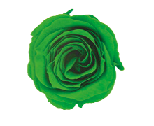
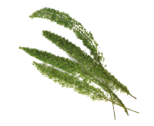
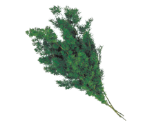
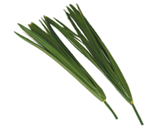
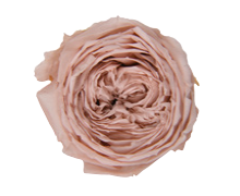
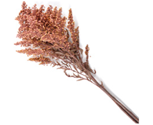
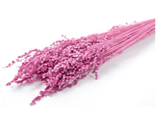
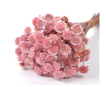
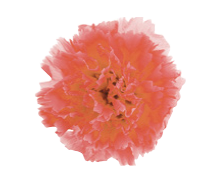
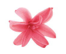
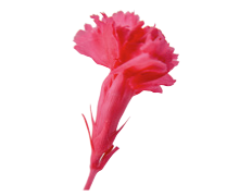
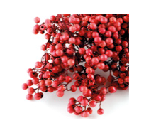
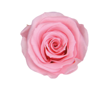
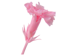
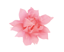
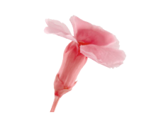
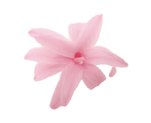
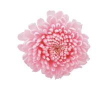
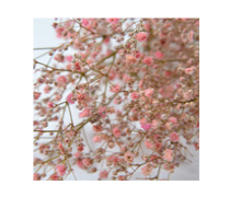
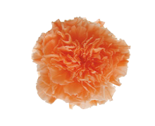
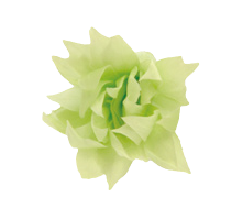
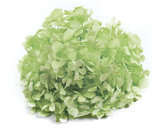
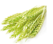
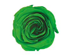
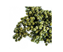
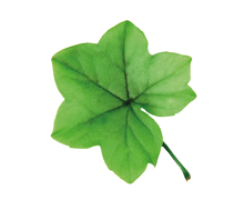
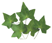
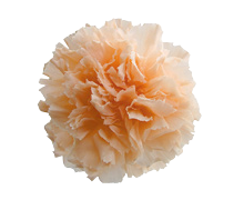
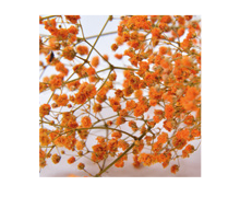
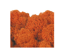
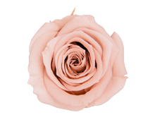
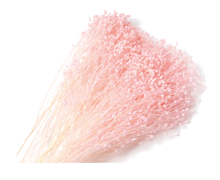
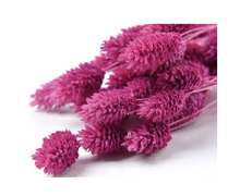
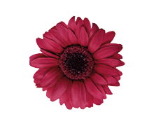
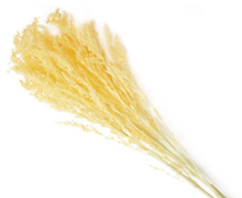
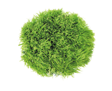
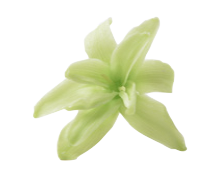
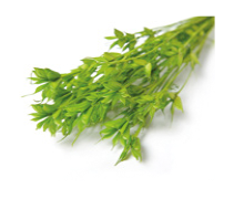
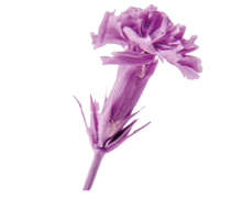
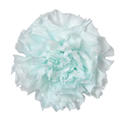
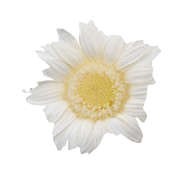
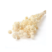
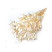
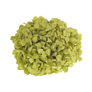
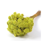
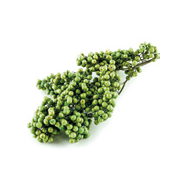
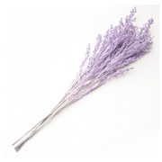
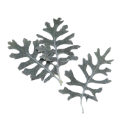
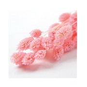
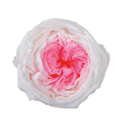
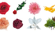
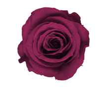
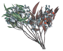
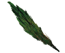
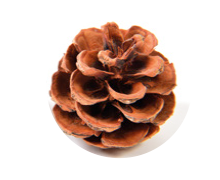
Flowers used in this arrangement
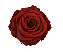
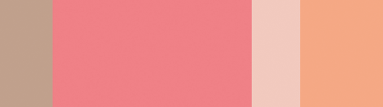
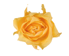
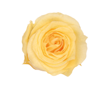
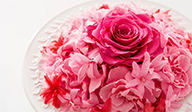
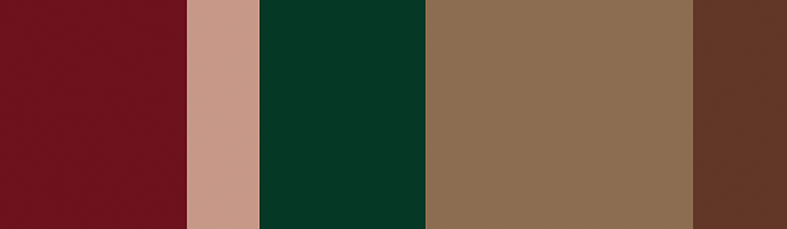
10-Wine
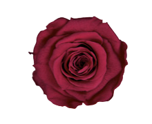
37-Cardinal
74-Wild Cherry
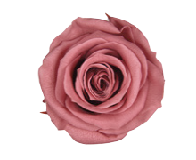
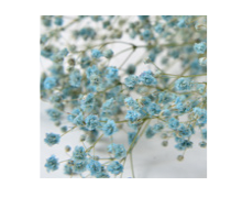
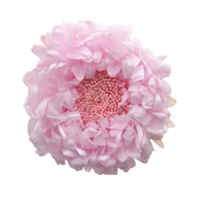
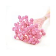
73-Smoky Pink
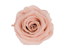
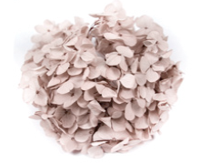
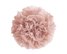
55-Nude Pink
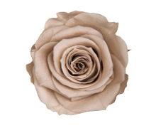
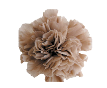
44-Hazelnut
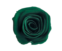
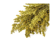
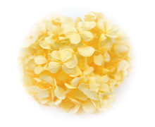
400-Forest Green
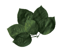
800-Green
800-Green
800-Green
800-Green
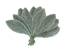
840-Gray
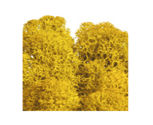
910-Natural
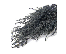
890-Black